 menu
menu
Starting from the start, as most things do, my idea is to have a portfolio style website.
How do I do this though, without really knowing what it takes to make a website? I've seen a lot of frameworks that all claim to make website building easy, and that's probably true if you put in a thousand hours to learn their ecosystem. But who has that sort of time?

Too much for one man to handle
Without even really scratching the surface, that sure is a lot of stuff to evaluate and memorize.
The obvious question then is, naturally, which one to choose? They probably all have their benefits and problems, and installing then trying each one individually would take far too much time.
What if I just choose the most popular one? That could work, but how do I know what the most popular one is? This warrants more investigation.
I could quickly jump in and just use php, as I've already got a portable xampp stack installed, but the general security of php without a framework seems abysmal. I could use a framework, but learning that on top of all the other stuff would take too much time. Php does make it pretty easy to get something up and running though, as I have used it a fair bit in the past to quickly get stuff done, but in a serious website making situation, I think I just plain don't know enough.
Anyway, after a whole bunch of reading I've come to the conclusion that the best way to make a site is with plain html, css and javascript.

It's node.js!
I think I'll use node.js not only because I already have it installed, but because it seems to be the biggest and has been around the longest. It also has npm, which seems like a nice tool for getting and maintaining packages.
I want the website to be easy to add stuff to, and to have a simple design that's easy to navigate. The page also has to load fast and be responsive, in fact this is my key goal for the site, making sure it loads very quickly.
I'll organise the site into three main sections: a gallery of all the good looking things I make, a section detailing the nitty-gritty of how I made the things look good, and this blog. I'll also put in a contact page, because every site needs a contact page.
This leads directly to the first problem: how wide should a webpage be? Well, a resposive website doesn't have any fixed width, and it's possible that people will be looking at it on potentially any device with a screen, but there's a limit to how long a line of text can be before it becomes unreadable.
For images though, the bigger the better, so I'll let their maximum width be the whole screen, so I'll use 960px as the maximum width which should look quite nice on both big screens and small.
I'll of course need a common header and footer that contain links to all the other pages, but they'll need to be collapsible into a easy menu for mobile screens.
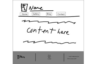
Yep, looks like a website to me
This is my first concept for the site. Not my best work, knocked out in mspaint after 2 minutes, but it gets the point across. Pretty sure this will do the trick, now to the simple task of making the html and css look like that. Somehow.
So the first thing I want to work on is the logo for the site, which will also probably end up as the favicon, I think I'll just go with a relatively simple black and white box with justified text in a nice font, because it is quick and looks nice.
I want images to span the whole page width. I run into some immediate frustration with trying to work out how to center the images, turns out html has a dozen ways to do each thing, and knowing what does the specific thing I want in a way that's compatible with mobile browsers and computer browsers is tough. Luckily I found css reference which lets me actually see what each css setting does in a pretty intuitive way. Turns out the setting I want is margin: auto; it's just so obvious (ha). Another site, w3 schools also has a lot of good info I think about html stuff. Specific positioning is becoming quite tedious though.
While looking around for a decent font to use, I found that Google webfonts exists. I do wonder though if it might have load time implications, having to load the font from another url might be slow. Ah, not to worry, the font that I like is 18.3kb and will be used for all the text, this seems okay as it'll probably get cached in the browser, or something. Now on to making the logo, if I just make it using html which font size type do I use? px? em? vw? I guess I'll use pixels. This seems to scale with view width nicely too.
After a large amount of being frustrated that the css file I was trying to make the site use wasn't being used, I saw in the Inspect Page thingy that user agents stylesheet was being used for some reason, and after googling it seems that my chromium based browser just does that for no particular reason? After some more searching, I found out about normalize.css, which effectively resets the browswer's css stuff to normal, so I can then put my css on top of it to actually style the page.
After spending far too much time trying to do the logo with css, I have decided that it's easier and faster to just make one in photoshop and just make it fit in a box in css. So that's what I did:

A fine first draft
As you can see, it doesn't look good. The text is too thick, the kerning is all wrong too. After a little while staring at it and thinking about it, I came up with the current one at the top left of the page.
Ok, so after a while trying to make a site with just html and css from scratch on my own, I have come to suspect that it will take an unreasonable amount of time to make what I wanna make. I need another solution.
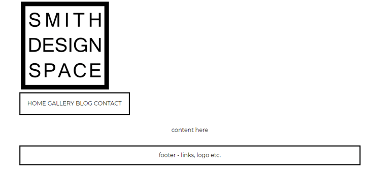
My beautiful layout
I found that W3 Schools has some templates that use their own w3.css stylesheet, and in their plethora of templates I found one that looks like a fairly good start for my desired layout.
An immediate problem for trying to integrate the way I'm writing this blog is that w3.css uses multiple css classes to style it's elements, which is useful in one way because I don't have to worry about writing the css myself, but is tricky because I need multiple classes attached to one in order to style things how I want.
I should probably mention that my initial idea for the blog portion of the site is to write it in markdown, because I think it will be easy to transform it into html for upload. Luckily I managed to find an npm package called Marked that doesn't have any dependencies and will output a some nice html. It can conveniently also be used as a function, so I can probably automate all the content publishing in the future.
I do know about the hundred million or so 'make a blog in 5 minute' tutorials out there, but where is the fun in following one of those?
One thing I wanted entirely because I thought it looked cool is the floating points behind the login screen on the Netlify homepage. Using the handy-dandy chrome dev tools and clicking on the background, I have discovered that they're using node garden, which is conveniently open source. So I took a copy of the script file and customised it for a while to make it look like it does now.

The node garden
I also removed the mouse interaction from it, which was harder to figure out than I thought it would be, although it was solved simply by adding style="pointer-events:none;" to the canvas element. And it works! But now it's in the wrong position when the browser window is wider than the page, another straightforward fix though, just change it to position:absolute; and done. Now, it doesn't display when the screen is too small, it's supposed to be hidden until the menu button is clicked, but it doesn't display at all. Love these little challenges that keep coming up.
A good while later, maybe a half hour or so, it seems that there's a problem with the hidden menu when the screen is not full width. I don't really know how to fix this, and all my attempts so far have failed. The menu looks fine without it, even though they still technically load, so i'm just going to leave it for now and come back when I'm more experienced/less frustrated with it.
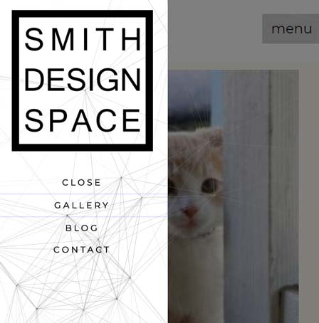
A problem with the garden
The specific problem is that it appears that my browser (chrome) is adding height:0 and width:0 attributes to the canvas and the div surrounding it, but only when the top nav element is hidden by default. My initial fix for this was to set the height and width and also the style's height and width when the open menu button is pressed. This doens't work and I don't know why, it seems there's maybe a race condition between when the height and width are set and when the function is called.
I want a showcase of my photos to be at the top of the page.
If i have a 4x4 grid, it looks fine, but if the window shrinks then it collapses into 2 colums, and eventually into 1 column on a very thin screen. This is fine, but with 16 images it becomes too long to scroll through. The solution I think is to paginate them into 2x8 images then 4x4 images, just got to work out the css to do that. How hard could it possibly be?
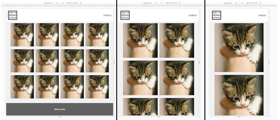
The look nice on small screens now!
Incidentally while I don't have a bunch of images to put up, I'm using place kittens for placeholders.
It occured to me that in regards to the nice floating node garden behind the nav menu, there's no reason for it not to just cover the whole page. I'm going to move it up to the top of the body and let it be an overlay with a z-index below everything else and stop it from being scrolled offscreen. This is so much simpler than trying to mess with the other css.
Time passes...
I've decided I don't like the look of the garden. It's too distracting and visually noisy, and it doesn't really fit with what I want from the site. The page also feels a bit dull and lifeless because there's no color anywhere. Also at some point I made the images greyscale until hovered which I do like but isn't helping the situation.
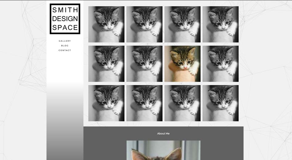
Mostly greyscale design
I have decided to remove the garden and replace it with a subtle but colorful gradient on the navbar, which has opened another can of worms. Styling a page with css sure does have a lot of challenges. An animated gradient seems pretty easy right? Well, haha my friend, you've fallen directly into a perfect trap! The way to add a gradient to an element's background is using "background-image: linear-gradient()" but looking at w3 schools' description, and by trial and error, we find that this property simply cannot be animated. Why? Because reasons that are surely very sensible. So what am I to do? According to the article I found on medium we could use javascript (no), an svg (also no), or just some other css. but what it suggests is to transition the opacity of an overlaid element. That works, but it limits us to two colours.
The genius solution I worked out? It's easy enough, given we're allowed to have transparency in our linear gradient. We have the transparent gradient on top of an element with an animated background-color, it's so simple. However, a problem that hit me out of nowhere is that css properties marked as !important cannot be animated. Why? Surely more good reasons. Therefore I've just got to go through and remove the bits that mark the color as !important. Also got to remember to make the overlay's height and width the same as the rotating colours' so it all fits right. The fun cannot be halted.
Now onto the simple job of making the images become tabbed when the sceeen is thin. A little bit of css and javascript should do the trick, the buttons are already in place thanks to the template and hidden by some css media queries I wrote earlier. The javascript was easy enough to write, but accounting for each case and screen width to hide/show the images was a bit annoying. There's probably a more effective way than brute force, but at least it's fast and the code is readable. One curious thing I discovered is that vanilla Javascript doesn't have a built in math.clamp function, which seems odd. There's still a bit more to do with the images, but I'll get to them when I have proper non-placeholder images to put there.
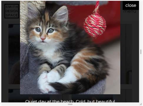
The text gets cut off when the image is opened in the modal
I have solved the full size modal image problem! All I had to do was make the image's element's style have max-height: 90vh! It's not 100vh because it looks silly having the image touch the borders of the screen.
The next thing to do besides writing some paragraphs about how great I am (I'll do that at some point between now and never), is to make the contact form functional. All it's gotta do is send an email to me when the the form is filled out and clicked. In my inital searching of the problem, it seems that everything recommends php for handling the form, which I could do but surely there's a javascript solution for sending an email?
It occurs to me that I can use node.js to do this, and I've found nodemailer, a npm package with no dependencies. So far I haven't actually used any node/npm stuff for this project, and this seems like a fine place to start. Installing and using it seems easy enough, all I've gotta do is work out how to get the form data into the script.
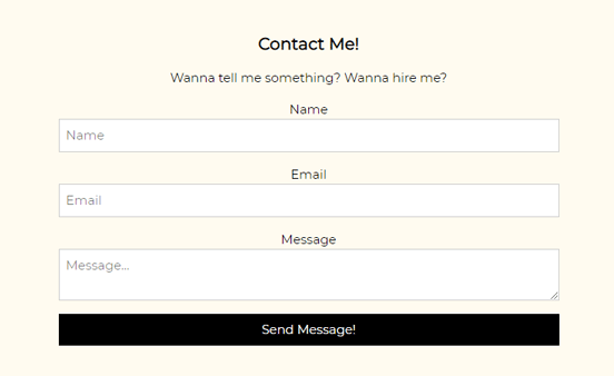
I also made the background a slight off white.
The default form submit button wants to navigate to another page when it gets clicked, as defined by the action part of the form tag. This isn't the behaviour I want, so by setting the target to "_self" I can get it to not navigate, but instead the page gets reloaded. This isn't what I want either, so I found out that I can just make a hidden iframe and set the form's target to the frame. This makes it so that the page doesn't reload when the button is clicked, and the javascript function is called through the onclick attribute of the form, which I can then use to both hide the form and do stuff with the entered data.
Now that I have the form data all I have to do is email it away. But there lies another problem. To send an email I need a webserver apparently. Looking further into it, it seems that my email host can act as an smtp server which I think is what I need, and because the site is being hosted on netlify I can use their 'functions' thingy, which lets me run a javascript function on their servers? It also seems to support node.js, which is convenient as heck and just what I want.
It has taken a fair while to make the email work properly, and I ran into a couple of issues along the way that weren't easy to debug, and were essentially educated guessing on my part.
First I had to work out how to get data from an html form into javascript, turns out html5 defines a FormData type which asks for an element, then just bundles the form data into key value pairs. Easy enough, but then I had to work out how to send the data out as an email. For this I wanted to send the email to myself, but from what I read this can only be done server side.
Searching google tells me that php is the way to do this, just set an action as the action of a form and bob's yer uncle. However as written earlier I can't use php because of my netlify hosting provider, I've got to use javascript instead. My next stop was to look at using an ajax request with xhttp or something, that seemed to not be a proper answer. Eventually I found the simplest solution, the javascript function fetch() which only wants a url and the data you want to send, easy as pie.
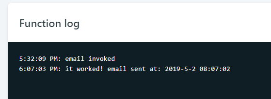
Sending an email successfully!
The next trick was receiving the data on netlify's end, which netlify describe as being a javascript file that exports a handler method. Simple enough, and setting it to just log the incoming data I can see that it works. All I've got to do from here is import the nodemailer module from earlier and use it. My first attempt resulted in this warning:
5:05:48 PM: (node:1) UnhandledPromiseRejectionWarning: Error: 140264722483072:error:140770FC:SSL routines:SSL23_GET_SERVER_HELLO:unknown protocol:../deps/openssl/openssl/ssl/s23_clnt.c:827:
5:05:48 PM: (node:1) UnhandledPromiseRejectionWarning: Unhandled promise rejection. This error originated either by throwing inside of an async function without a catch block, or by rejecting a promise which was not handled with .catch(). (rejection id: 1)
5:05:48 PM: (node:1) [DEP0018] DeprecationWarning: Unhandled promise rejections are deprecated. In the future, promise rejections that are not handled will terminate the Node.js process with a non-zero exit code.
Which to me doesn't make a lick of sense. My best guess is that I was returning the wrong thing from the function, but I can't be sure. It seems the problem was that netlify is expecting the callback function to be called to let it know that the function has been completed, so calling that as the nodemailer's SendMail function's promise callback thingy seems to have fixed it. It also complained about being an async/await function, so to google I headed once again to try and find a solution. I stumbled upon a nodemailer example which does exactly what I want, it must be my lucky day, so copying it almost word for word, it worked immediately.
I used netlify to hold the secret username and password for the email client to send the emails, but I wrote them apparently wrong which gave me this error:
5:43:46 PM: (node:1) UnhandledPromiseRejectionWarning: Error: Invalid login: 535 Authentication FailedWhich was handily fixed by removing the quotes from the value part of the netlify environment variable. Now I've got it to the point where it successfully emails me and I get a notification on my phone, I am quite pleased. There's just one problem, the email's body is unreadably by a human. The string appears to be base64 encoded, but I'm not sure whether it's the formdata or the fetch call encoding it. This isn't really a problem because I can simply decode it before sending the email. A quick search tells me that atob() is the function for decoding base64 strings, but it gives me this error:
TypeError: t.body.atob is not a functionNow that's a strange one, guess I'll have to find another way to decode the string. Further searching finds me the Buffer.from() method which takes a string and an encoding and returns a decoded buffer, and luckily the nodemailer can take a buffer as the email's text, so the problem is solved, the contact form is now fully functional!
Next, while trying to think of stuff to properly write on the main page, I'll make the blog page, which I want to be a list of pages generated from the .md files, listed with a small description and an image too. I quite like the way casey muratori's blog looks. Using the page I've been working on as a template, It's time to make the blog page.
Setting up the template for the page was easy enough, all I had to do was strip all the content from the main page and make a little template for the blog post link, which I decided will be an image with some text on it so it's easy to click, and some tags so they can be found and sorted easily.

A template for my blog post listings
While this looks good, I want the date I posted the post to be under the image inline with the tags, my initial thought was to put the post date and the tags in their own spans inside the p element, and set their text alignments separately. this didn't work. I learned through a quick search that I only need a span on the tags part and can have the main p element text-align:left; and set the tag span to float:right; and it just works. Sometimes css is ok.
Making the tags clickable was rather simple. All I had to do was write the tag inside an a element and set the href to javascript:void(0); to make it do nothing when clicked, but set the onclick to a function that simply writes the link's text in to the filter box and then calls the filter function.
Another small problem I ran into while setting up the blog page, the go-to-top button that only appears when you scroll down wasn't appearing. the reason I discovered is that the script that sets the scrolling to a function wasn't getting called, because the line before it asks to get a button by it's id, but the button doesn't exist on the page, so the script errored and stopped execution. My solution was to add a button with the same id, but make it do nothing and hide it.
Now to actually write the generator for the blogs, all it's gotta do is call marked to transform the .md into some html and insert that into a template, then add an entry into the blog page on the site.
Writing the code was quite straightforward, the challenge was finding a way to index all files in a particular subfolder and only grabbing th e.md and .html extensions, but I found an npm package called glob that does this, but I couldn't figure out how to use multiple arguments with it, so I just manually separated them afterwards. The next trick was to only get the md files that don't have a corresponding html file, because that means they haven't been genrated yet, which I accomplished with a simple filter which looks like this:
let diff = htmlFiles
        .filter(x => !mdFiles.includes(x))
        .concat(mdFiles.filter(x => !htmlFiles.includes(x)));
It's probably wrong in a bunch of ways, but it seems to do what I want. The next thing to do is read in the md file, extract a bit of metadata from the top of it to generate an entry on the main blog index, read in and replace the body of the template file, and finally write out the data to a new html file.
A note about the metadata, I decided to use the format: Title || Post Date || Tags, because if I need to update a post in the future the order of the posts on the main blog page won't change because the date is entered manually.
Incidentally, it seems I've run into a small version of what is known as 'callback hell', because the current count of callbacks in the blog generator is 8. This seems like a problem, and there's almost certainly a better way, but I've been following what was written in the official docs so it's probably fine? The code does what I want it to do, but it feels just a bit wrong, you know?
One problem with javascript function replace, it seems that with the way I'm using it the function doesn't want to be used as a dot function, it wants to be used on the right side of an equals sign. In theory the system I've written handles multiple files, but it has sorting problems, mainly in that it doesn't do any sorting. It also empties the blog.html file when multiple .md files need to be built.
I've tackled a lot of little things like making sure the image links inside the posts are written correctly, handling the multiple tags for the listing and having an off-by-1 error with the length of all the posts together and changing all the styling on the listings.
I also added in the ability to update the blog inside vscode using the tasks function so I can just press a button and have it all happen auto-magically.
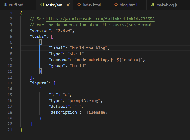
My blog making task in VSCode
While trying to style the blog posts a little more, I've discovered that css has no previous sibling selector. The reason I discovered this is because I want to remove the margin between the image and it's caption, but the image is wrapped in it's own p tag as a result of the markdown generator. My solution to this was to translate the caption using css TransformY(-10px); to move the text upwards a bit, it seems to work fine but might break on mobile.
To make the blog images have their own modals, all I did was copy across the modal block that's initially hidden from the front page to the blog template, then modify the text returned from the .md to .html conversion to include the onclick="openModal()" stuff to make it actually functional, however I found that javascript's replace function doesn't automatically replace all instances of the search string when using string.replace, it only handles the first instance, so again I had to search the web to find out that regex is needed to make it function properly.
The next immediate problem is that the generator wasn't getting the text for the modal's caption from the image's caption text, so I had to search and find how to navigate through the html DOM to find the image's parent's next sibling, because that's where the caption text is stored because of how the .md to .html conversion works. To finally get to the image's caption it's: element.parentNode.nextElementSibling.innerText. luckily iterating through the process was easier thanks to the modifications I made to the blog making process I made earlier.
Finally, after a while, I've fixed up most of the little problems that I've found, and made the front page images come from the proper folder instead of a temporary placeholder service, I've also made the text for the front page modals be handled in an easier way, they're just html strings selected by a switch in the javascript, because it's the easiest way to keep them all in a reasonably sensible place.
Seeking information about website favicons and immediately discovering that it's a total mess thanks to safari, chrome, firefox, windows and html all being able to ask for different icons depending on what size they want. Searching further and finding this favicon generator which takes an image and makes it into all the right things, pngs, icos and all that with some html and a .webmanifest (whatever that is) and some xml, to make the icon look right everywhere.